I saw on CNN of all places a cool ticker graphic which I would like to show you how to create. This graphic is a great exercise in patterns and the motion filter. This tutorial will have you exploring Photoshop up close pixel by pixel to get the results.
Create a grid pattern
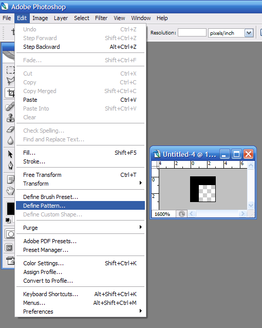
Create a new 3px width by 3px height document with Background Contents set to transparent. Take the pencil tool set to 1px diameter (basically a pixel block) set to black and pencil in the upper and left most edge of the document. Then go to menu, Edit >> Define Pattern. The pattern we just created will be used for creating the led light bulbs of the ticker.
Set The Stage
Now that you’ve created the grid pattern, you need to create a new document of large width ( I suggest a width of 770px and height of 90px ). Fill the background of the document with dark shade of grey (almost black) like #373737. Create new layer. Now create a vertical gradient with the top of color value #373737 and the bottom #1c1c1c (in the color picker palette you can copy and paste these values). Set this layer to an opacity of 10%. Finally, create a new layer so that you can create to black bands (7px in height) to go across the top and bottom of the document.

Apply the grid pattern
![]() Create a new layer. Now take the Paint Bucket Tool and change option from “Foreground” to “Pattern” in the Option Palette (usually just below the menu). Pick the pattern to create in step 1 and fill the layer with the pattern. Duplicate this layer. Change the opacity of the top most grid layer and set it to 17% and set the bottom grid layer to 70%. We want to create to layers because all of the lettering and images on the ticker needs to be sandwiched in between these two layers.
Create a new layer. Now take the Paint Bucket Tool and change option from “Foreground” to “Pattern” in the Option Palette (usually just below the menu). Pick the pattern to create in step 1 and fill the layer with the pattern. Duplicate this layer. Change the opacity of the top most grid layer and set it to 17% and set the bottom grid layer to 70%. We want to create to layers because all of the lettering and images on the ticker needs to be sandwiched in between these two layers.

Create the lettering
Now it is time to create any text or logos you want to be displayed on the ticker. For text, I suggest creating each letter using the pencil tool instead of using the text tool. With the proportions I used, I made the a line three grid blocks wide (9 pixels) for letters like T, H, L. For letters like A, O, I made the width 1 pixel more than two grids (7 pixels). Remember to leave this layer in between the two grid layers.


Add Pop to Text
Now that you’ve create all the text you want to appear on the ticker, now its time to add pop to the text. With the text layer selected, and apply a layer style gradient (in the menu under Layer >> Layer Style >> Gradient Overlay). Set the gradient to white to black with the top of the lettering the white part. Set the blending mode from “Normal” to “Overaly”. You may want to play around with the opacity, but I tend to leave it on a percent in the 90’s.

Add the effect of motion
If you’ve ever stared at a ticker, you’ll notice that the letters aren’t as sharp in your vision when they move. This is because your eyes hasn’t adjust to the motion of the text so it leave the image a little bit blurry. We can give this effect in Photoshop by applying a motion blur. Duplicate the layer(s) with the text on them. Select the lower duplicated layer and go to Filter >> Blur >> Motion Blur. Set the Distance to 11 pixels and Angle to 0 degrees. Take the layer opacity down to 80%.