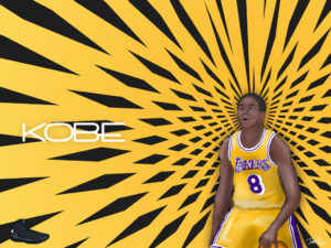
In this Photoshop tutorial, you’ll learn how to set up Photoshop so that it can use the tablets input, create an outline from a photo, color and shade all using the tablet. The tutorial includes a time lapse of the process I took to creating the final product.
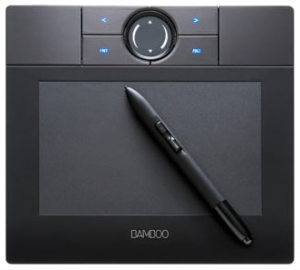
 A graphic tablet allows you to take Adobe Photoshop to a new level. You can take advantage of the brush tool and it’s powerful ability to imitate different traditional mediums of art and human input. For this tutorial, I’ll be using a Wacom Bamboo tablet. It’s Wacom’s (Wacom is the industry standard supplier) most inexpensive tablet ($79), but still does a good job. Tablets can range from the Bamboo which has only pressure sensitivity, to monitor tablets with pressure & tilt sensitivity. The monitor tablets are relatively expensive investments though. If you’ve never used a tablet before, it will take some time getting acquainted. One thing that would throw me off was that when I draw, I like to rotate the paper to draw straighter, but that doesn’t fly on a tablet because the cursor becomes disoriented on a non-monitor tablet.
Start Large, then downscale. The most important thing to know BEFORE you start, is to start BIG. Working on a large document will allow you to zoom better but more importantly downscale all the minor imperfections you would see at a larger size. Start at least twice (four times is optimal) the size of what you expect to be the final image size.
Step 1: Outline
For this tutorial, I’ll draw Kobe Bryant from an image. One great thing is you can draw an outline right on top of the image. Create your document (remember 2x or 4x it’s intended size) and import any reference images making sure you resize the image to take up the appropriate space in the photoshop document.

Setting Up the Brush with Tablet
The first thing you’ll want to do is create a new layer for the outline. To set up the brush controls, take a hard round brush (the size depends on the size of the document). To enable the tablets input, we need to access the Brush palette ( Menu Bar >> Window >> Brushes ). First set the spacing to 1% under the “Brush Tip Shape” option. Next enable the “Shape Dynamics” and set the Size Jitter control to Pen Pressure & the Roundness Jitter control to Pen Tilt. Since my tablet doesn’t have tilt support, you see a caution sign next to the tilt control. The tilt isn’t necessary, and you may even want to remove it even if you have the ability.


The brush settings
Tracing Tips: Now that you’ve set up the brush, you can trace out the photo. If you pay close attention to the video, during the tracing stage, I traced the outline two different ways. The first way which you see in the beginning, I made the outline of thick solid lines. Later on, I switched up and made the brush size smaller and created more swift short strokes to get a smoother and accurate line. I then took the eraser and cleaned up the up the line. The reason I switch to a more sketching type approach was because the lines I was creating with on solid line was not coming out as I intended. (Thats why you see me undo a lot in the beginning.) Lock this layer so that you don’t alter it in later steps.

Step 2: Coloring
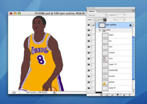
Once you’ve completely traced the image, create a new layer for each color you intend to use. Put these layers below the outline layer, and fill in the drawing. Naming each layer is a good idea so that your organized. I use only a few colors because I’ll add depth in the next step. Keep within the lines!

Color the outline on different layers.
Step 3: Shadow & Highlight
Again, create a new layer above both the outline and the color layers. For this step, we’ll be dealing with soft brushes with low opacity, because you want to avoid sharp lines in the shadow. Generally, when I add depth the opacity of the brush is 3-5% and no greater than 12%, . To add a shadow, use a black brush and a white brush for highlights. The photo was a great reference to know where the shadows and highlights where. Keep in mind that you can always undo, and just mess around and see what you come up with. The time drawing I made in the time lapse took 5 and a half hours to create start to finish.

The shadows and highlights.
Adding depth to the face
The face of the subject is trickiest part of this tutorial. If you look at a face, there are a lot of bumps & curves and thus a lot of subtle places to shade. For the eyes, there is a shadow cast under the eyebrows, and light on the top of the eyelid, then shadow on the lower eyelid followed by light cast on the cheek. There is light shining on the forehead, the nose, the top of the lip under the nose and the top of the chin.

Places to shadow and highlight on the face
Conclusion
There you have it. All you have to do now is tie up and lose ends and downscale your drawing. When you downscale, you’ll suddenly know why I told you to start big.


